energi
A beverage packaging concept using a restrained metallic base, vivid color accents, and a compact graphic identity.
DisciplinePackaging / Advertising concept
CollectionDesign explorations
01 / The direction
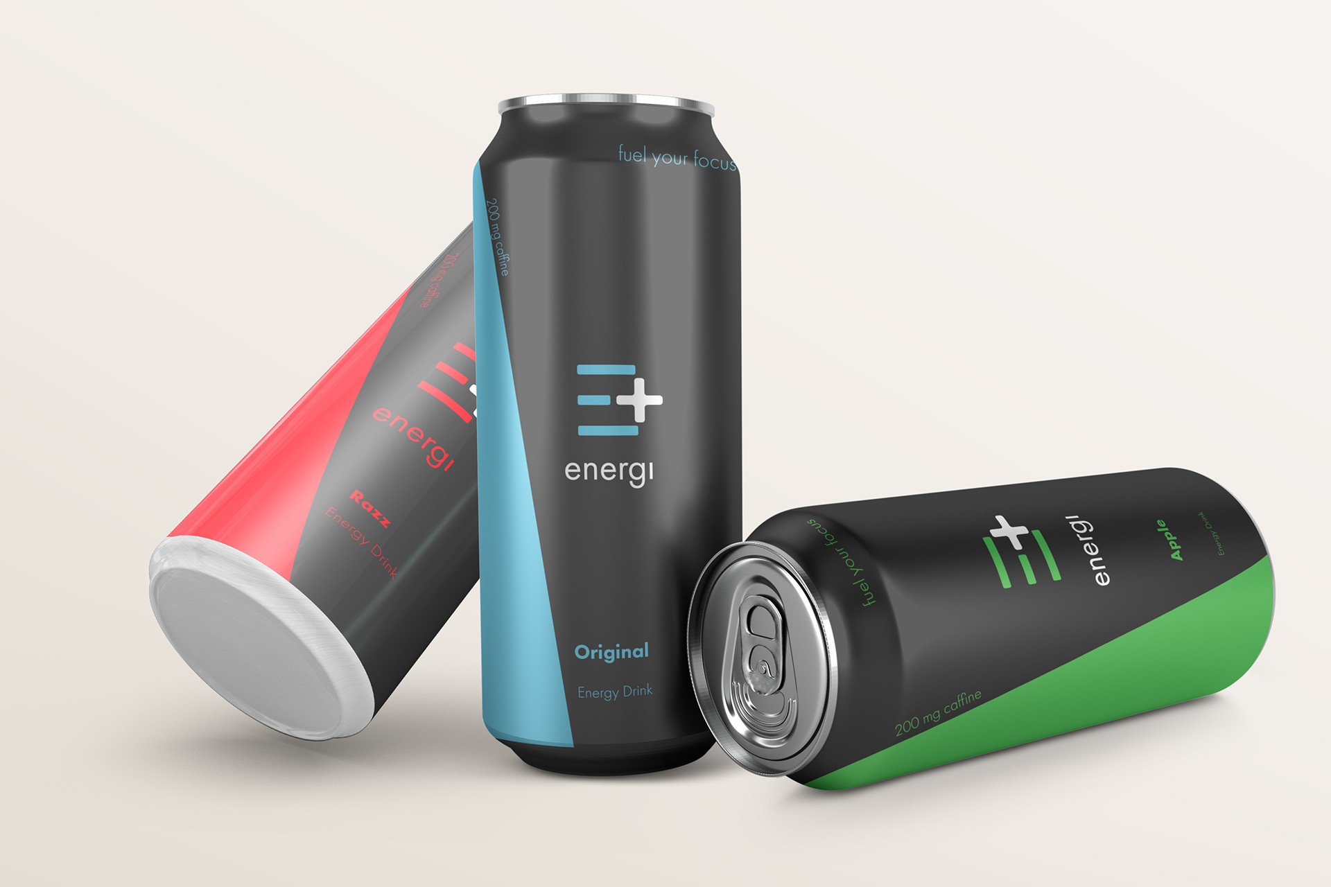
A clear place for color.
The can designs use color to distinguish the variations while retaining a consistent layout. The minimal treatment leaves room for the material and product form to stand out.
02 / In detail
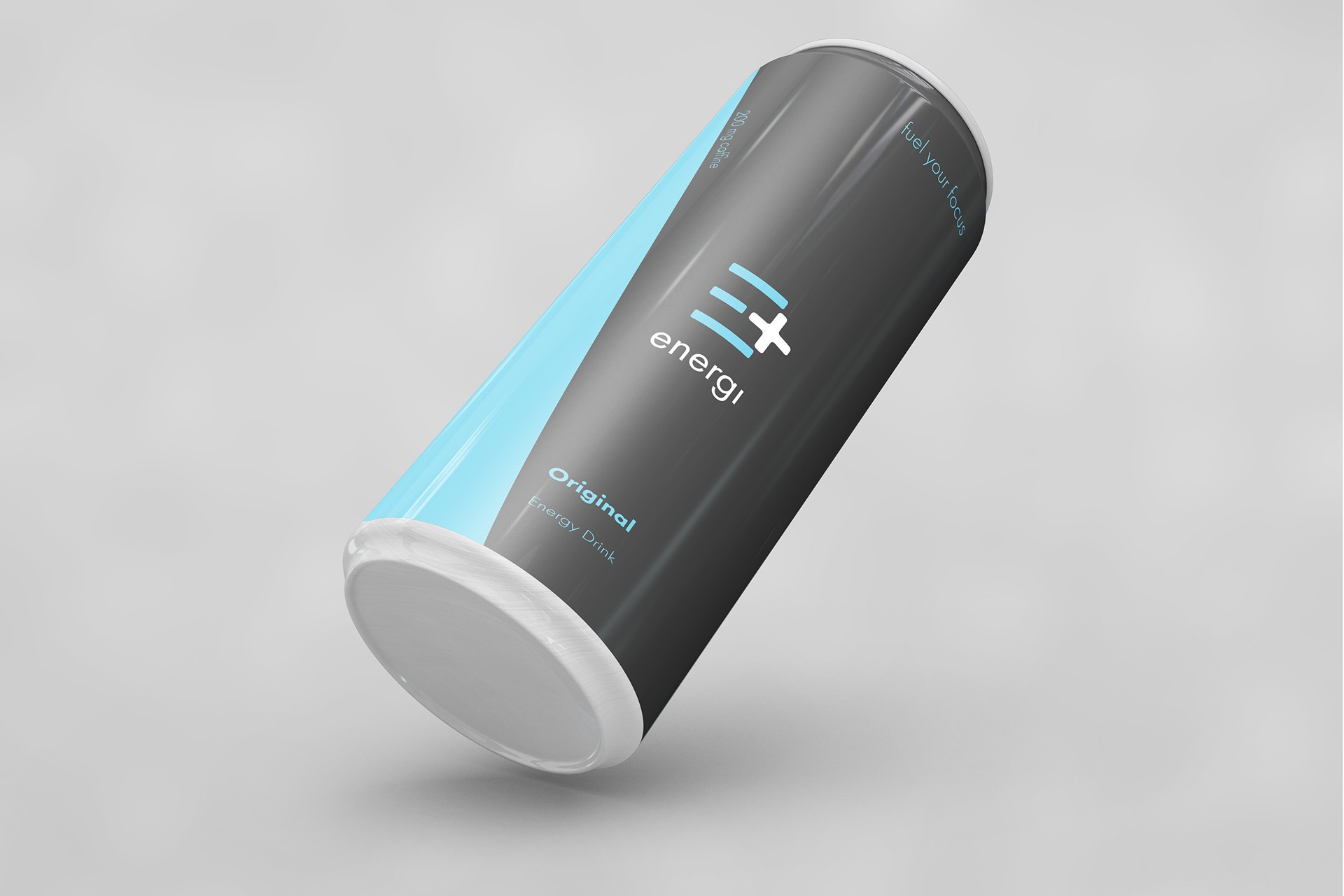
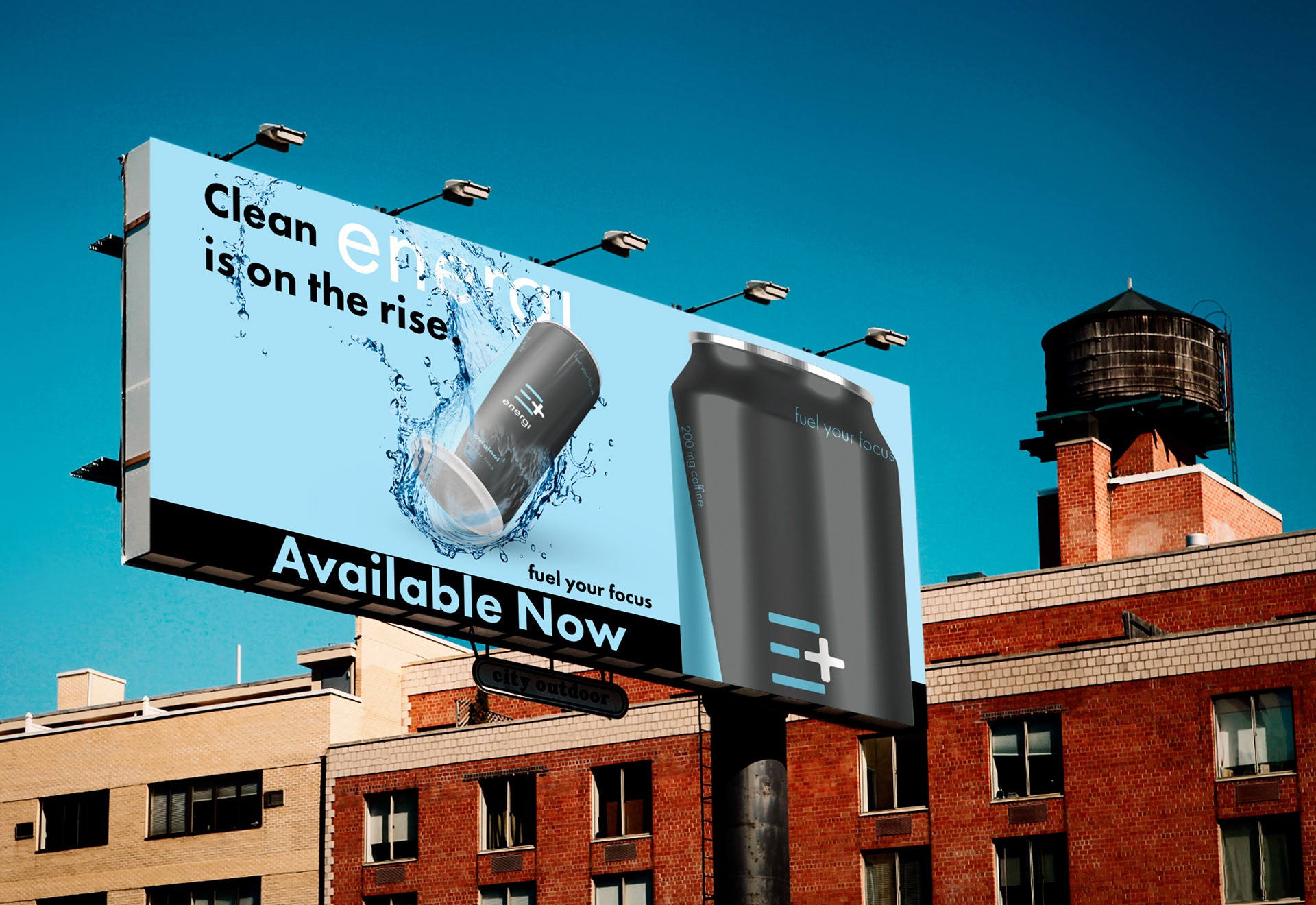
From package to promotion.
Product renders and an outdoor advertising mockup show how the same design language carries from the can into a larger campaign format.
Next project